
Hey everyone. I’m considering changing my book cover. The current one is plastered all over my blog right now. I assembled it from bits of this and that, but looking at it now and comparing it to covers in the same genre (Space Opera), I’m thinking it’s a bit bland.
What I want is something that suggests the book is about big ships and naval battles. I want the majesty of the ancient sailing ships like this.

I also want an eye-catching color palette and motion, like something big is happening.
In short, want majesty and motion.
Luckily for me, an artist named Luca Oleastri makes terrific spaceship art for a great price. So many great pieces, in fact, I’m struggling which to buy.
I’d like your help then. I made some sample covers from thumbs which contain a watermark. This protects Luca’s copyright and also helps me get an idea of what the final product would look like. Of the possible book covers below, which would you most likely buy?


Let me know which you would pick in the comments. Thanks!
My book is here.


I like all of them! In preference I’m angling for the first one because the lettering has a slightly more modern vibe to it. But there’s really nothing much to choose between them.
LikeLiked by 1 person
Thanks, Matthew. Now you know why I struggle to pick one.
LikeLike
Love the style of all of them, tricky one! I feel I’d lean a little more to the second one, loving the ship design and contrast with the planets behind.
LikeLiked by 1 person
A bunch of other folks like this one too.
LikeLiked by 1 person
Well, the old cover already did it for me. 🙂
But if I had to pick one out of these three, I would pick #3: in the first one the light and the title blend a little, the 2nd one feels a little claustrophobic with so many planets. #3 is not ideal either, as the ship looks like some sort of an adorable robotic toy animal.
LikeLiked by 1 person
Hehe. I’m leaning towards the third too.
LikeLike
I like the third one best. I think you put them in order of increasing appeal, either subconsciously or because you want the third one picked and you know how people react! But good luck with whichever you choose.
LikeLiked by 1 person
I think you may be right. I eventually picked the third. Stay tune for a new cover.
LikeLiked by 1 person
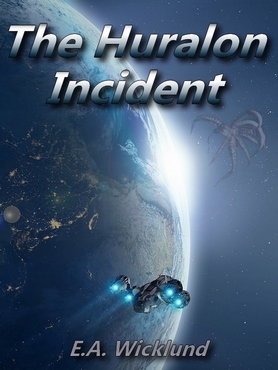
I quite like the original – especially the little “spider” in the corner. But if you’re going to change it, I’d say either #1 or #3. I think #2 is a bit Star Wars-ish (Death Star/Imperial Cruiser)
However, having said that, I’d buy it no matter which cover you used. LOL simply because you wrote it 😀
LikeLiked by 1 person
Totally with you. I eventually went with #3. On another front, I’m composing a Chummy story in my head. A different machine, so not named Chummy, but the same characteristics.
LikeLiked by 1 person
Oooh, a Chummy-like character. Looking forward to reading that 😀
LikeLiked by 1 person
Thought you might like that. 😉
LikeLiked by 1 person
Indeed 😀
LikeLiked by 1 person